
About
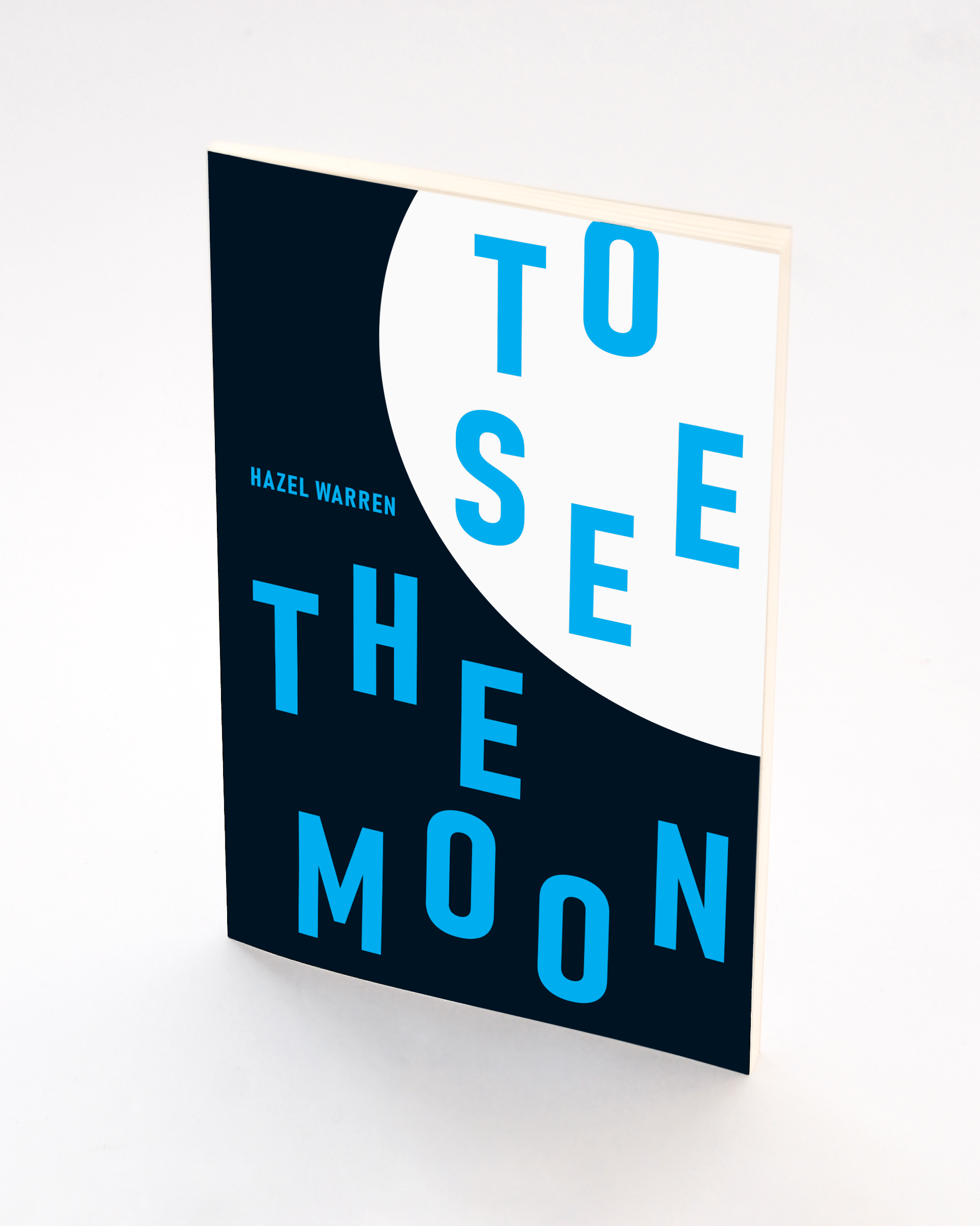
A delight to work with fellow creators. This is the first book for a Hazel Warren a highly skilled Nottingham poet who writes and performs her poetry. Beautifully constructed work full of life and character.
Creative Rational
The cover uses type and shape in elemental ways to draw the reader eye to the beauty within the book at the same time visually representing the title boldly and loudly. Condensed grotesque typefaces have a timeless strength and impact, loud, paired down and yet somehow beautiful. The typeface 'Bahnschrift' used for the cover is closely related to the font 'Din' that gets its name from DIN 1451 a standardisation for letter form designs created by the German standards body 'Deutsches Institut für Normung' in 1931. It is a wonderfully adaptable and elegant Grotesk that has a classy condensed boldness.
The design allows the reader to consider the truth that letters are symbols that form words which represent language. The design allows the letters to be fluid in a that way poetry so often is.