About
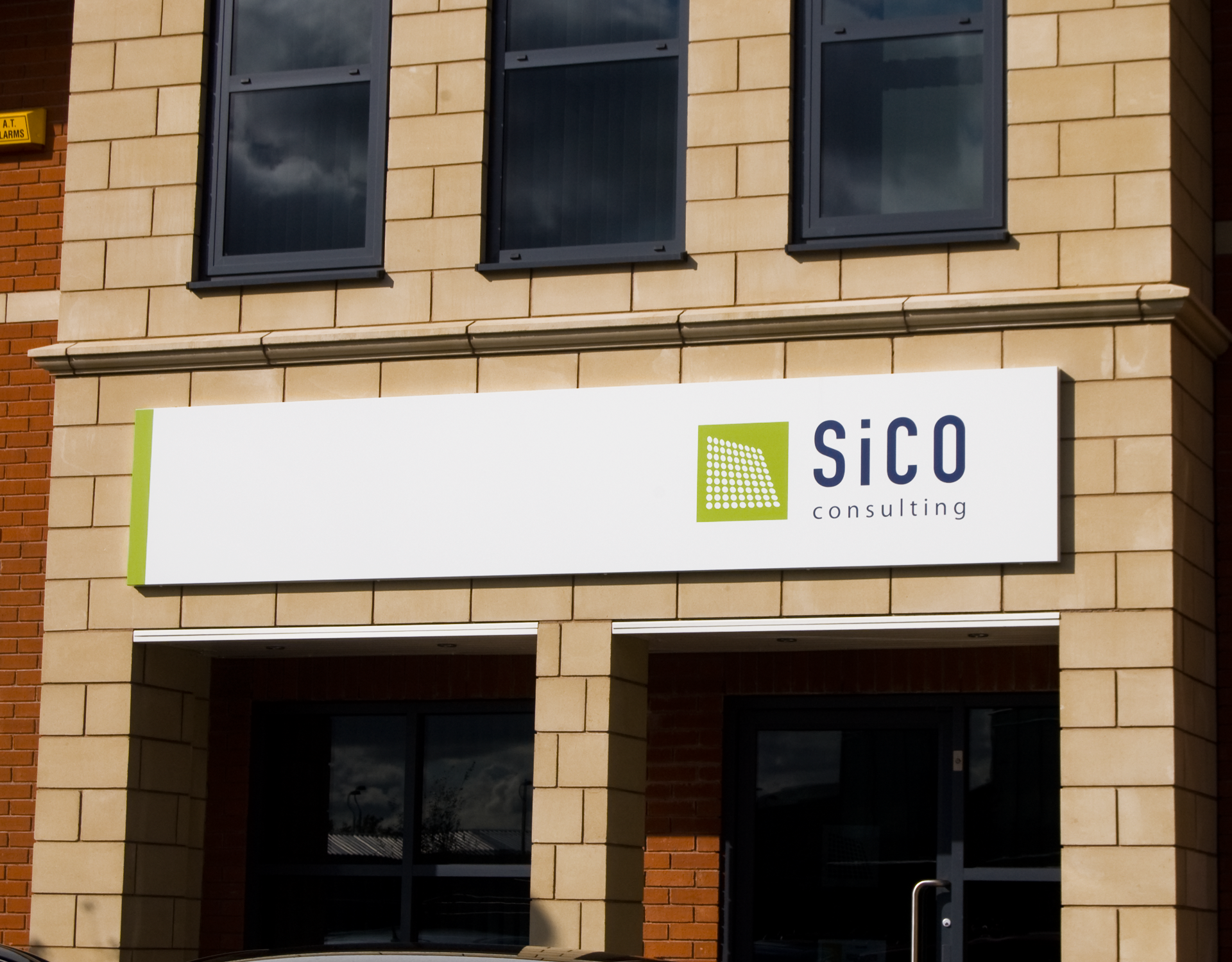
Sico consulting. The name comes from the first two letters its founder's first and last name, Simon Colton.
The company designed and created the internal engineering of buildings, making those buildings live and breathe They were looking to expand their presence in the building market. They had a number of keys words that summed up their services, light, flow, energy, structure and sustainability.
The company designed and created the internal engineering of buildings, making those buildings live and breathe They were looking to expand their presence in the building market. They had a number of keys words that summed up their services, light, flow, energy, structure and sustainability.
Creative rational
The logotype mark reflects these words whilst symbolising the internal components and their dynamic, structural relationships. The repeated, related circles create a sense of life and light within a structure. Building at their most basic are created from blocks, a simple square says 'structure' at its most basic level. They are the living, breathing components that symbolise the very heart of Sico Consulting's work. The green speaks of sustainability and the blue speaks of sky and the context of buildings in the built environment. A bold European Grotesk typeface lends a sense of authority with the lowercase 'i' pointing to a friendly, approachable organisation.
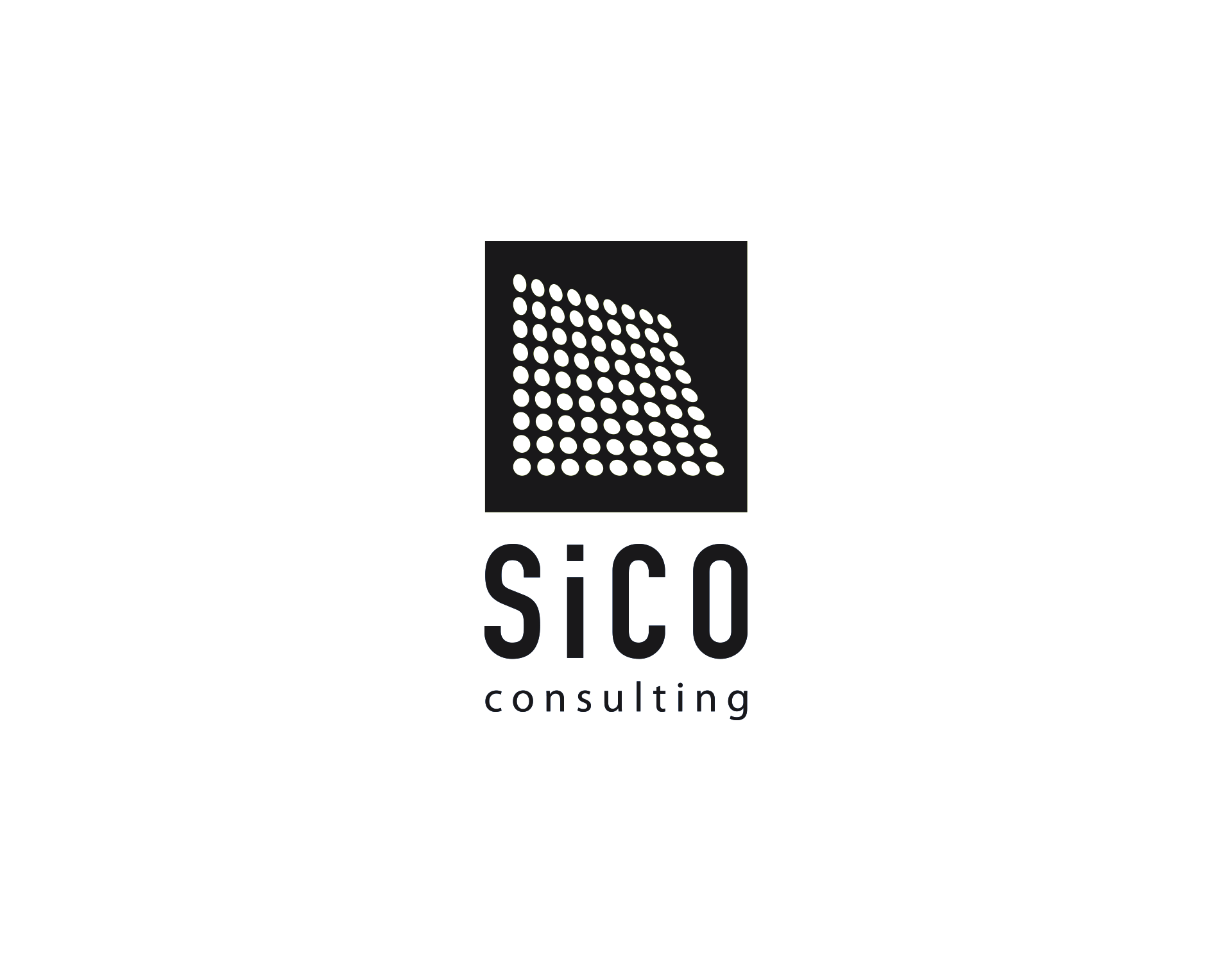
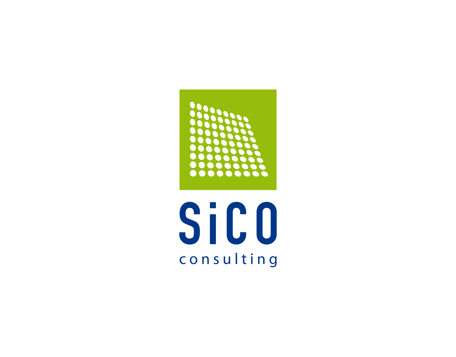
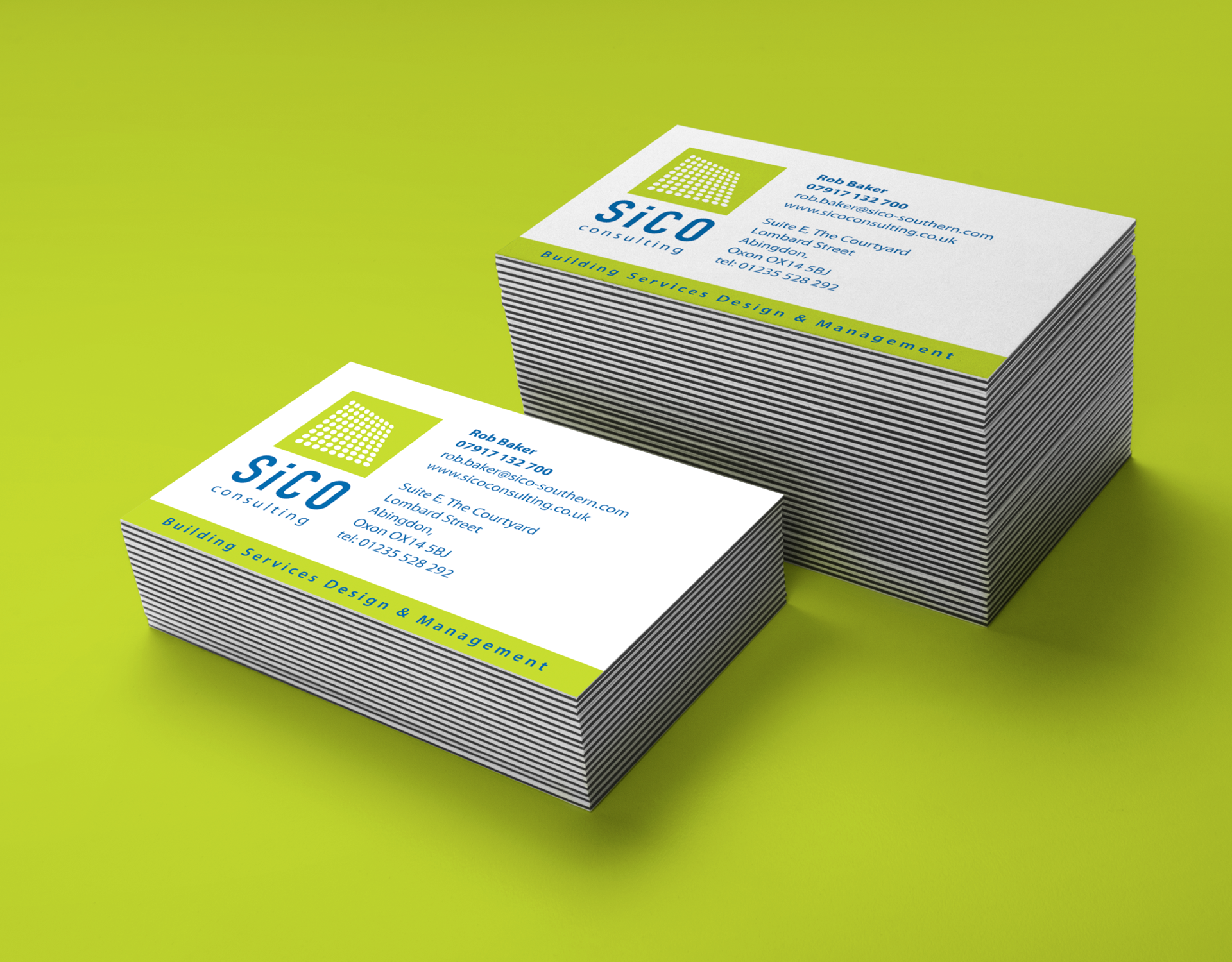
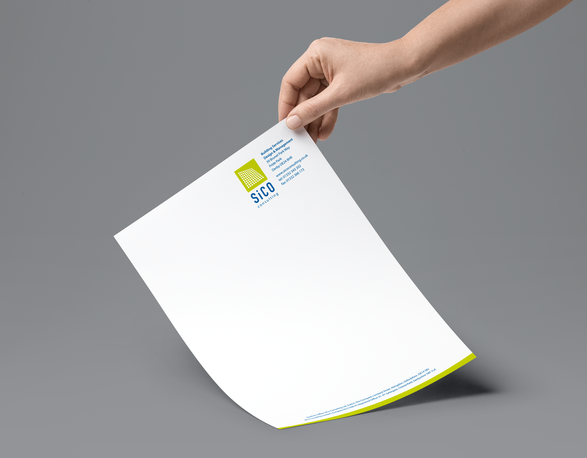
Sico consulting designed and created the internal engineering of buildings, making them live and breathe. The logomark attempts to reflect dynamic, light internal engineering of a structure. Whilst the colours point towards sustainability.